The Evolution of Infographics (and a look back at 2016)
- Jun 14, 2025
- 2 min read
In 2016, I was honoured to be profiled by Easelly, the infographic platform known for helping people turn complex ideas into clear visuals. They featured my piece titled: "Social Sharing and Audience Growth: A True Story."
This infographic told a simple but powerful story: how organic content, posted with intention and consistency, can result in genuine audience growth. It tracked data over time and visualised the connection between storytelling, shares, and sustained engagement. Easelly highlighted it as a great example of how infographics can make data relatable and accessible — something I’ve carried into all my digital content work since.
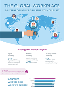
In 2017-2019 working as a Global Content Manager, Infographics were HOT, and I created several to meet the demand in the workplace industry.
Fast forward to 2025, and the world of infographics has evolved significantly.
While static designs still have their place, today's infographics are becoming interactive, web-based, and embedded into live user experiences. From scroll-triggered animations to clickable data layers and real-time dashboards, infographics are now built to do more — not just show more. They invite users to explore, drill down into data, and even personalise what they see.
Here's one I did earlier
Keeping on trend with workplace technologies, I created the concept and content for an digital infographic experience "The history of the workplace"
Some key learnings I’ve embraced in 2025:
Responsiveness is essential – infographics must perform across mobile and desktop.
Motion adds meaning – subtle animations can guide the eye and tell better stories.
Interactivity increases retention – clickable or hoverable elements keep users engaged longer.
Tools have advanced – platforms like Flourish, Infogram, and custom HTML/CSS options now offer far more than drag-and-drop design.
Looking back at that Easelly profile reminds me how far content design has come — and how powerful a well-crafted visual still is in cutting through noise and connecting with people.


Comments